Case Study – Improving Deposits
Aligning user needs and banking objectives to drive shared success on deposits. Resulting in improving recurring savings methods share of total deposits with 22% in one month, empowering users to reach their financial goals faster and banks to meet their business objectives.
The Problem
At Doconomy, I work with a savings product centered around personal savings goals (dreams) and saving triggers (savehacks). Originally built as a B2C application leveraging behavioral science to make saving fun, the product transitioned into a B2B2C offering integrated directly within partner banks’ native apps.
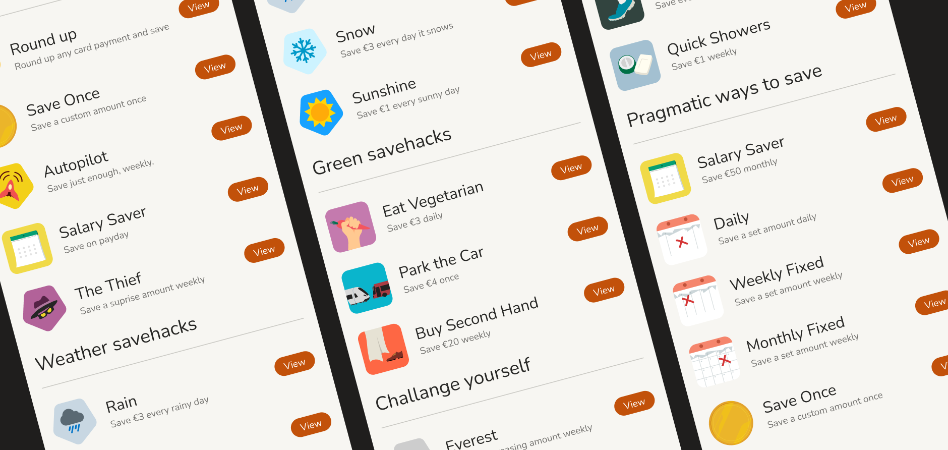
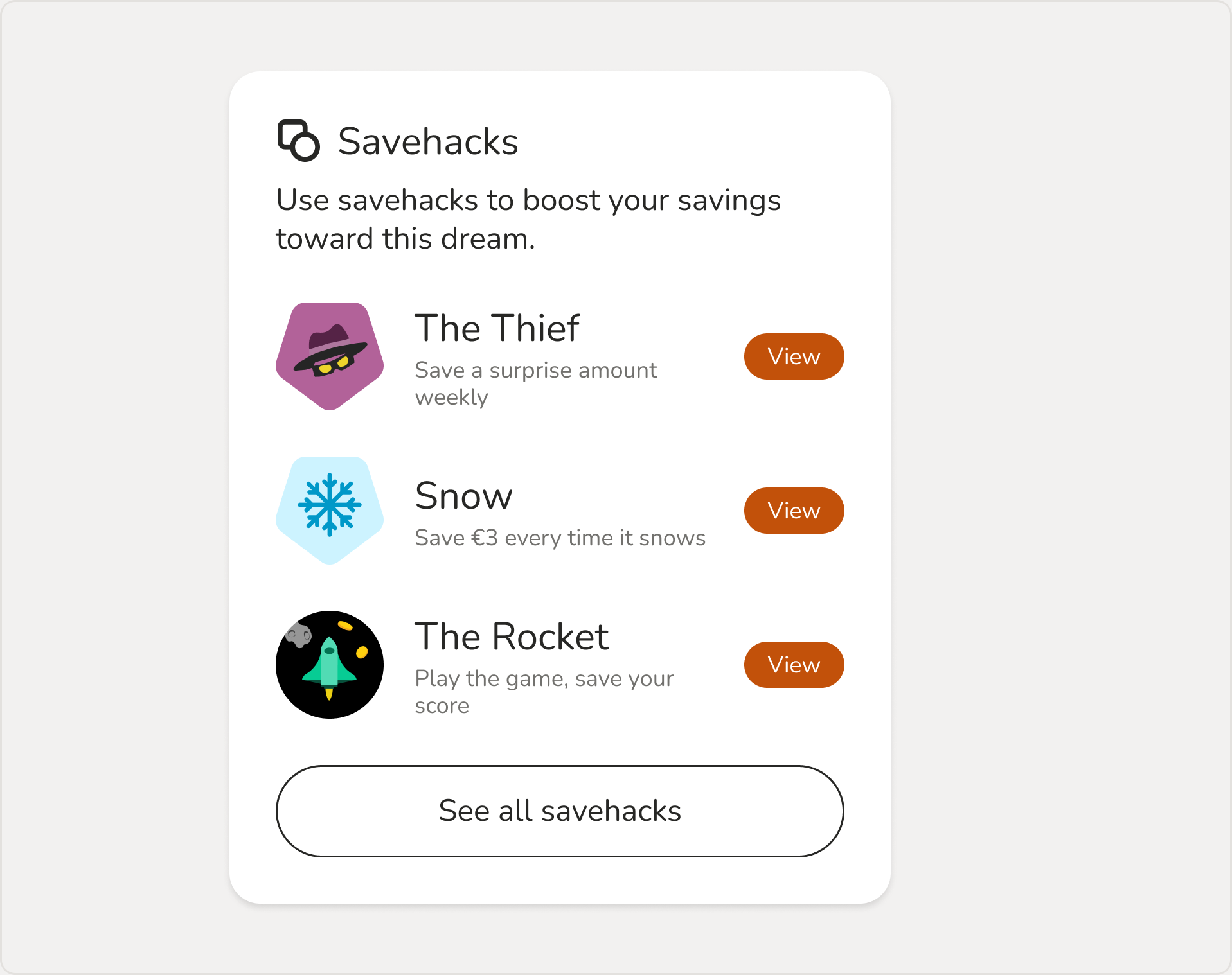
Analytics and user testing revealed a fundamental disconnect: while savehacks were great for marketing engagement, most users simply wanted basic, dependable ways to deposit money (one-off or recurring). However, the existing interface forced users through a complex, savehack-centric flow just to make a standard transfer. Users had to scroll past a mixed list of gamified triggers like “The Thief” or “Skip Coffee” and standard options like “Save Once” or “Monthly” to complete simple actions.
At the same time, our partner banks wanted to increase recurring savings. This presented a clear opportunity to align user needs for efficiency with key business objectives. The kind of win-win situation I as a designer always aim to find.
The Team
I was driving the work together with our UX Strategist. We got a brief from the Product Owner, after we had surfaced the problem a few months earlier. Throughout the project, we collaborated with Engineers, Head of Experience, a Behavioral Scientist, Customer Delivery Managers, and others in our organization to align the user experience with business requirements.
The Process
Before diving into solutions, we analyzed existing touchpoints to uncover why engagement bottlenecked. We evaluated key user data, synthesized historical research notes, and mapped out all available savehacks.
“I picked Monthly because it’s what I’m used to.
The others felt more like a game.” User feedback from earlier usability testing
While not all users favored gamified mechanics, savehacks remained a vital differentiator for partner banks. We needed a design that served both basic utility and engaging features without friction.
Deconstructing the user experience highlighted key gaps: the original design focused heavily on onboarding but lacked a sustainable feedback loop for long-term use.
To understand the savehacks better, we looked at user data, previous research, and testing notes, and I started categorizing each savehack based on type on a Miro board. From the initial mess, a clear picture started to emerge. Each savehack could fall under one of 4 categories: once, automated, repeating, or trigger-based. But even within these, there were differences. Some were pragmatic, while others were for fun or to find an expense to cut. What stood out is that these were completely different ways for users to interact with their dream; they could not all just follow the same flow and live in one single list.
After mapping the user journey to pinpoint pain points and opportunities, we moved into conceptual sketching.
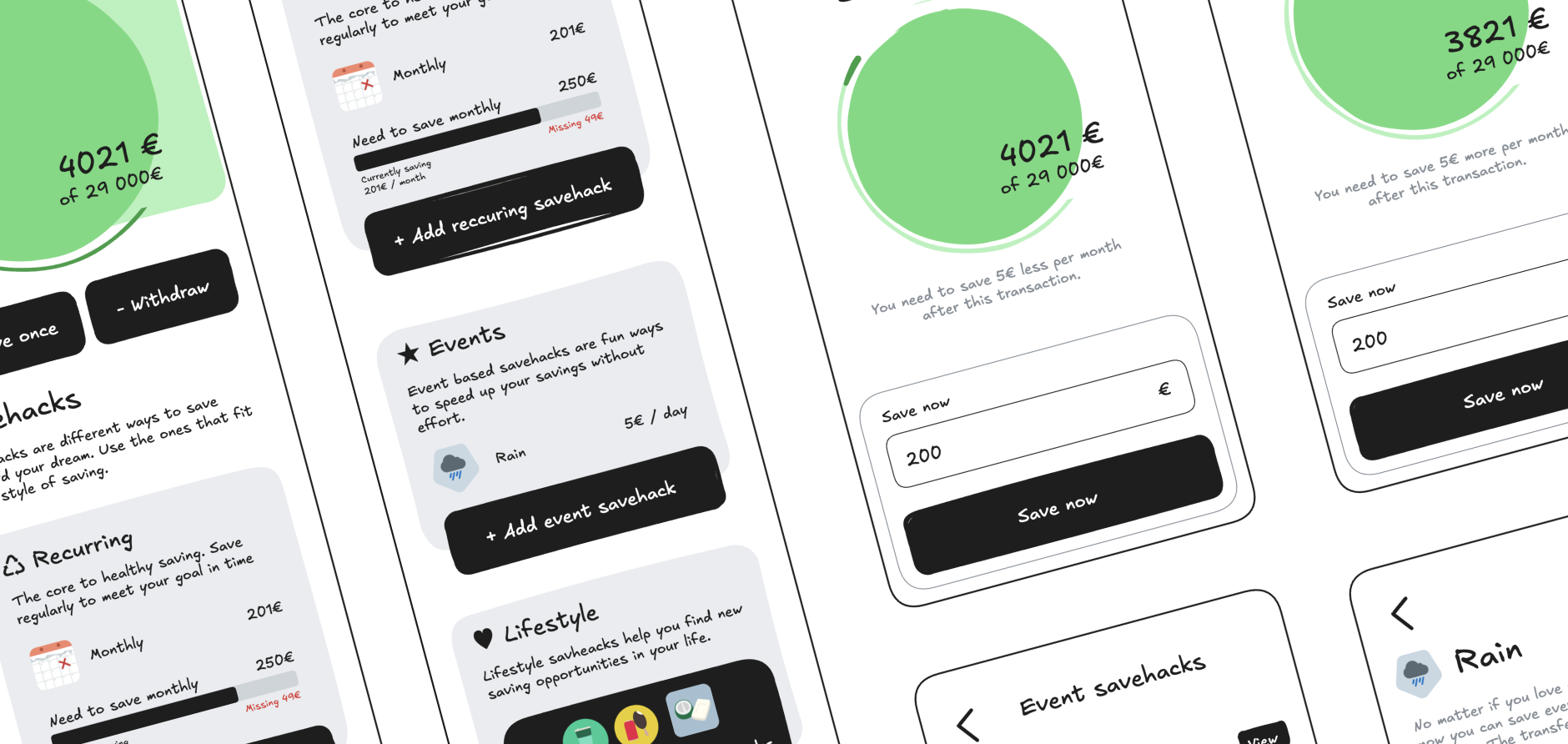
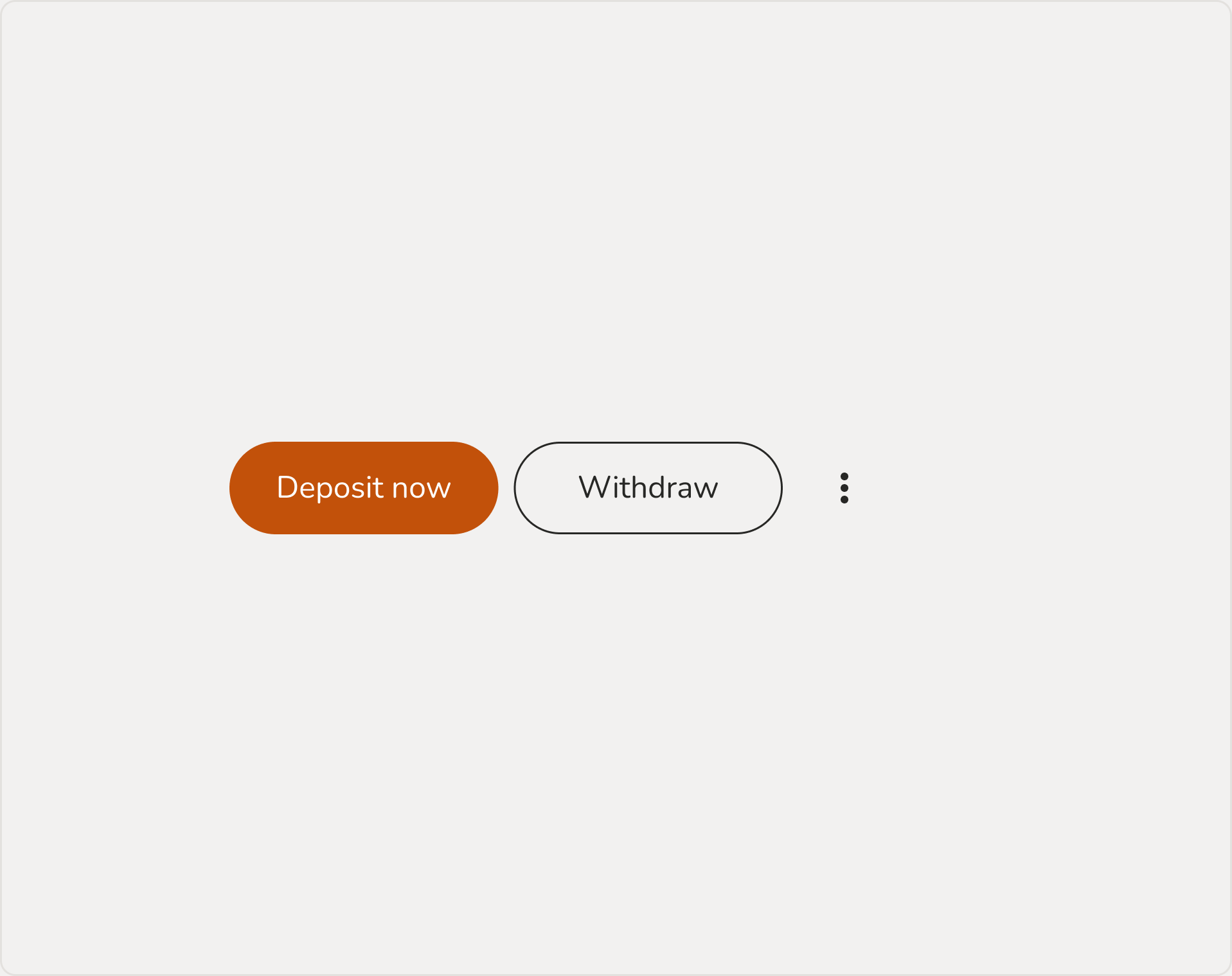
We validated initial concept sketches internally before building an interactive prototype. Usability testing confirmed our hypothesis: separating core utility actions from gamified savehacks allowed users to deposit money instantly without hesitation. Surprisingly, this separation also elevated the savehacks themselves, giving them a distinct space as high-value, optional features.
Not everything was good though, as is often the case. This first prototype explored a lot of ideas, some better and some worse, and we had to drop or park a few ideas that did not perform as well.
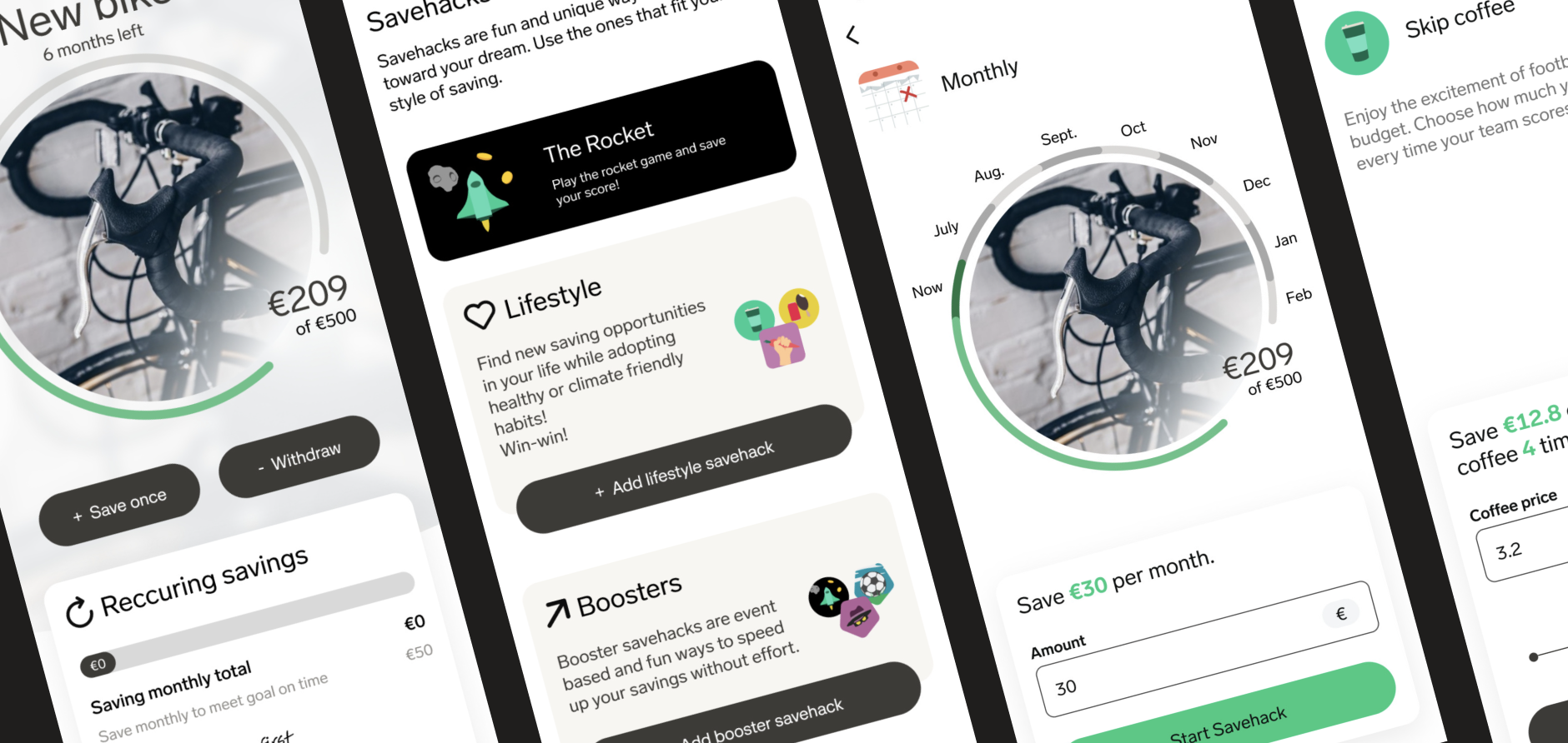
We continued to iterate with updated and new prototypes, more user testing, and internal discussions until we landed on a solution we were happy with and that was small enough to implement as a first improvement.
“I would do monthly and maybe another savehack as they are really fun. It is very clear to me what does what!” User feedback during final validation testing
The refined structure allowed users to onboard and manage savings goals intuitively, resolving key friction points identified in earlier iterations.
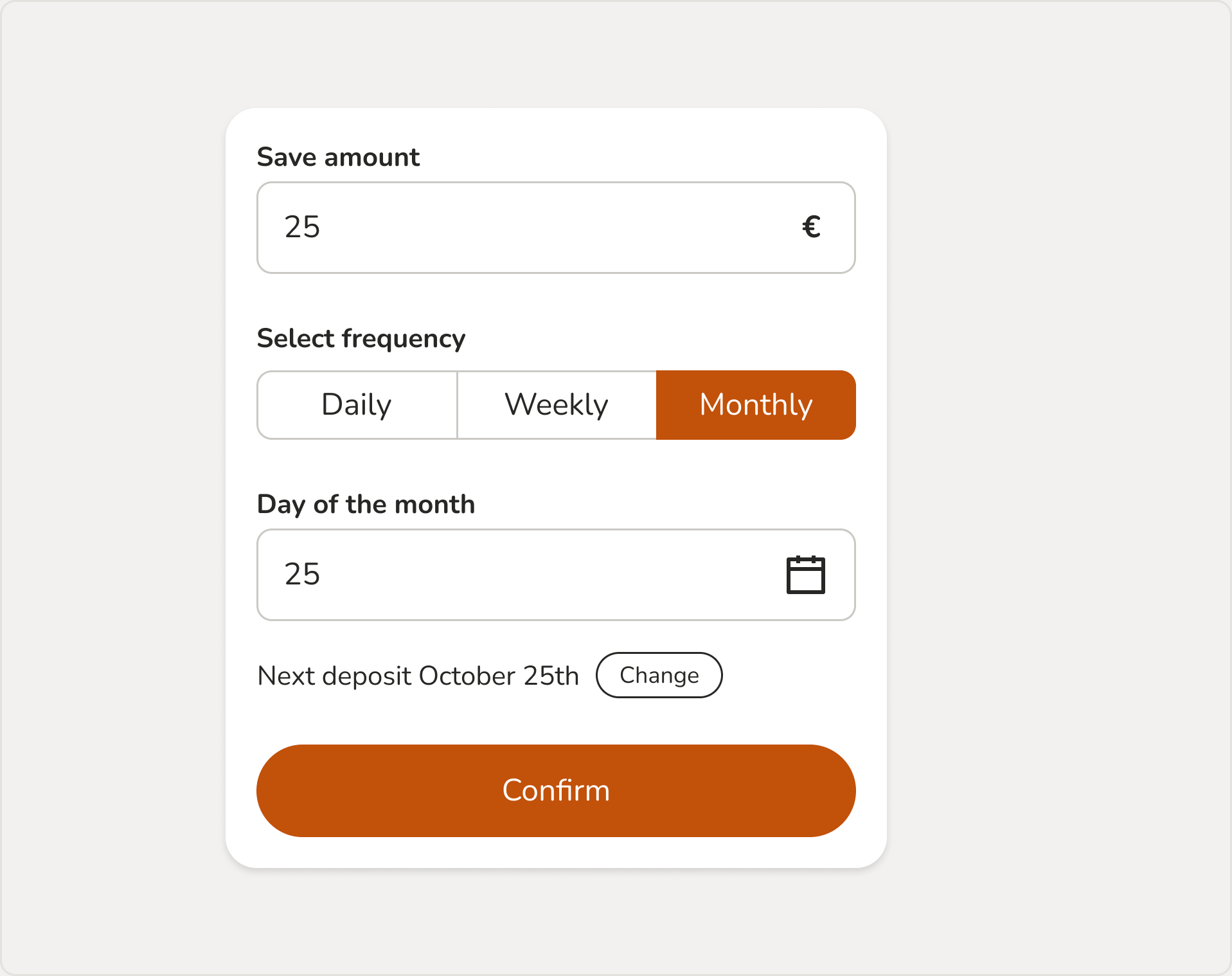
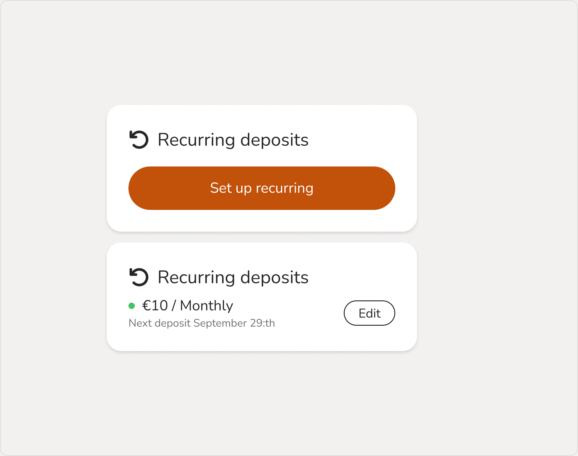
Working closely with engineering and product leadership, we divided implementation into two logical phases: prioritizing recurring savings set-up first, followed by quick one-off deposits.
During final UI polishing, I aligned components and colors with our Design System, defined micro-interactions, and documented edge cases and specs for engineers.
The Result
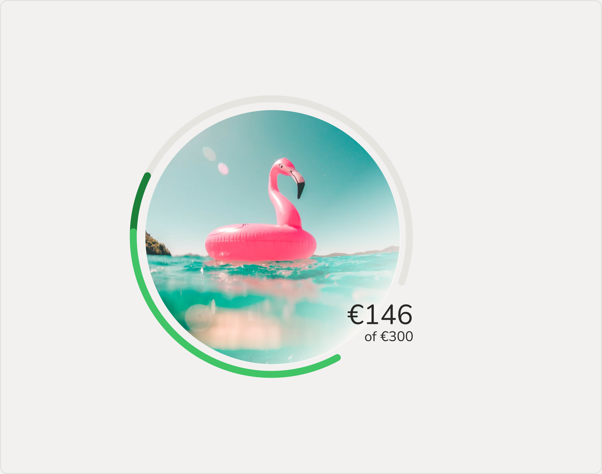
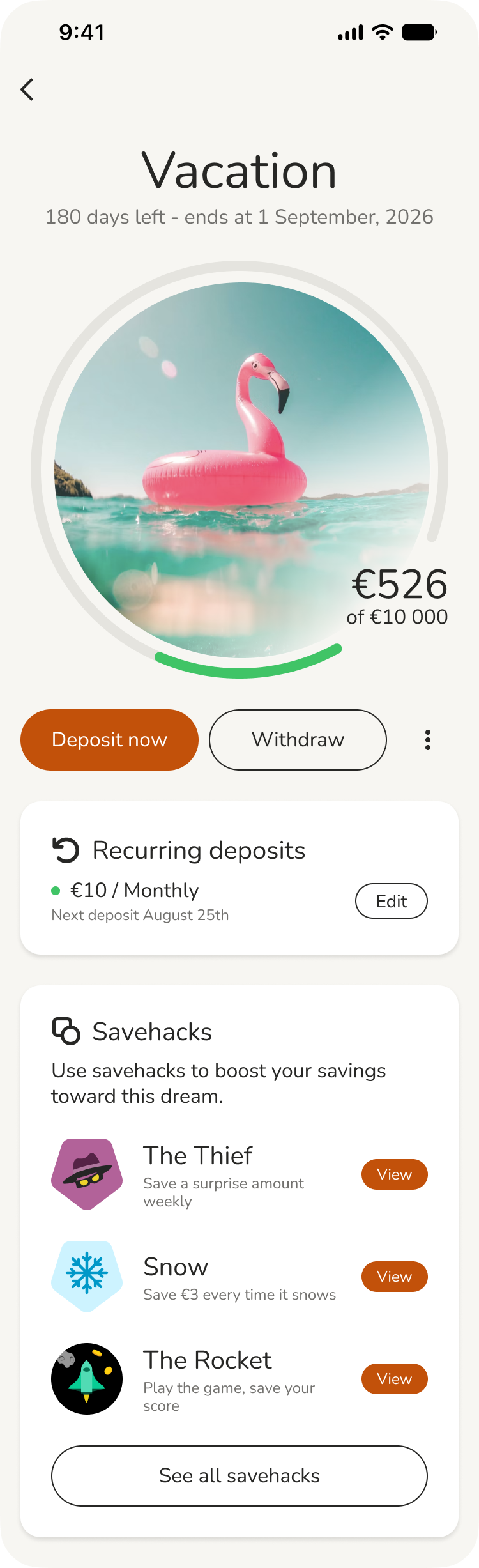
The redesigned experience successfully evolved the app from a marketing-first B2C showcase into a mature, utility-driven B2B2C product suited for consumer banking environments. Users gain immediate clarity on their deposit impacts and recurring savings totals, while savehacks reside in a dedicated space that highlights their unique value.
While I supported the engineers on the implementation, I also updated our design system components, updated core Figma libraries, and published documentation for customer delivery teams.
The first partner bank to launch the updated flow got a 22% increase in recurring savings share relative to other deposit methods in month one, settling into a sustained 11% average increase over subsequent months.
“I like it, I would want it
on my bank’s home screen” User feedback